fynk
Marketing Website
•Jan 2026In November 2025, I was hired by fynk, a contract management platform based in Germany, to rebuild their entire marketing website. fynk had a complete Figma redesign ready to go, but their existing Hugo site was running on legacy tooling that needed updating.
They wanted to migrate from Tailwind CSS v3 to the new v4 architecture while implementing complex animations, interactive carousels, and polished UI components across 20+ pages. Everything had to work smoothly on mobile, tablet, and desktop, with full support for both English and German content.
fynk cover image
Approach & Execution
I kicked things off by tackling the Tailwind v3 to v4 migration. This wasn't just updating a package—v4 completely changed how Tailwind works, moving from JavaScript config to CSS-first architecture. I ripped out the old PostCSS pipeline, converted everything to the new system, and got Hugo compiling cleanly.

Why teams choose fynk
Once that foundation was solid, I built out the design system: custom fonts, the full color palette as CSS variables, typography utilities for eleven heading sizes and six body text sizes, and six button variants that could be reused everywhere. This upfront work meant I could move fast later without constantly building one-off components.

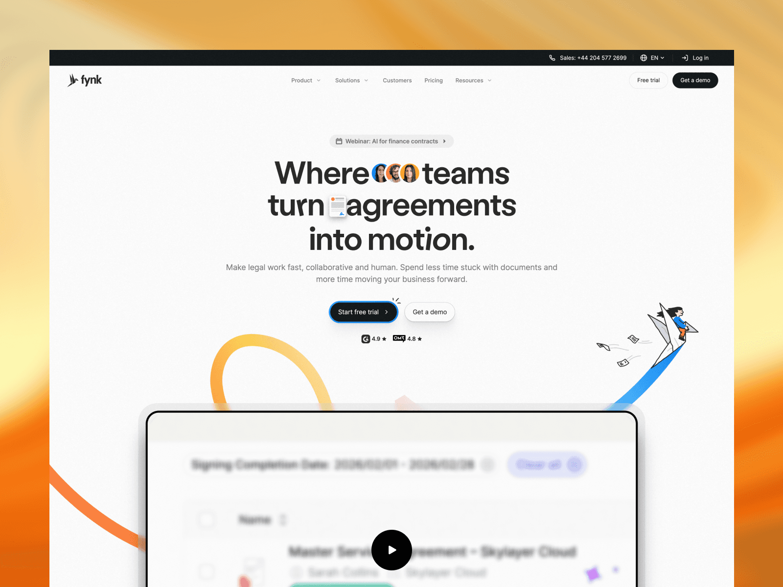
Landing page demo
The homepage was where I needed to prove myself. I built a hero section with scroll-driven video that would autoplay when in view and pause when it left the viewport. I created a customer carousel with Alpine.js that smoothly transitioned between active and inactive states—and then refactored the whole thing from 303 lines of duplicated markup down to 155 by making it data-driven.

Boost hero section
I implemented a "Why teams choose fynk" section with responsive grids and decorative elements scattered throughout, and a solutions section that toggled between Teams and Industries categories with smooth animations. The team loved it and immediately approved moving forward with the full site.

Real impact section
For the remaining 19 pages, I established a pattern that would carry through the entire project: break everything into reusable partials, make components data-driven wherever possible, and build flexibility through props. A page that started at 650+ lines would get refactored down to 20-50 lines of partial includes.

Why fynk demo
I built scroll-driven trace animations for the Why fynk page, Lottie-powered carousel cycles for the Get Clarity section, YouTube video integration that responded to scroll position, and filtering systems for the blog, case studies, and templates.

Customers section
The pricing page got a synchronized monthly/yearly toggle that would update both the hero cards and the comparison table simultaneously. Everything was responsive, everything pulled from data structures, and everything could be easily maintained.
Key technical patterns:
- Converted duplicated markup to data-driven arrays and loops
- Used Alpine.js for all interactive state (toggles, filters, accordions, carousels)
- Built scroll animations with Intersection Observer for smooth performance
- Cleaned up unused CSS utilities across multiple passes
- Converted images to webp and implemented lazy loading
Impact & Results
The project completely transformed fynk's web presence. I delivered 20+ fully responsive pages with sophisticated interactions and a clean, maintainable codebase underneath.

Blog index page
The component architecture I built means adding new pages is now straightforward—you compose from existing partials, pass in props to customize, and you're done. No need to understand hundreds of lines of HTML or duplicate markup.

Clause library page
The code got dramatically cleaner through this process. Main layout files shrank by 80-90%. The design system became fully documented through CSS custom properties that anyone could reference. The Tailwind v4 migration set them up for long-term success with modern tooling. When Petra's team did their final QA review and found refinements they wanted, each fix was quick because everything was modular—change one partial and it updates everywhere that partial is used.

About us demo
Most importantly, the trial structure worked exactly as intended. The homepage demonstrated I could deliver quality work and communicate well (I sent daily Slack updates showing progress and blockers throughout the project). That built enough trust to convert the trial into the full engagement. The project wrapped in February 2026 with a smooth handoff and a client relationship built on transparency and attention to detail.
Key Takeaways
Foundation work pays off. Spending a full week on the Tailwind migration and design system felt slow at first, but it saved me countless hours later. Every component I built during that phase got reused 5-10 times across the site.

Customers hero section
Data-driven components eliminate bugs. When I converted duplicated markup into data structures, it wasn't just about cleaner code—it made entire categories of bugs impossible. You can't create styling inconsistencies when everything renders from the same template with the same data structure.

Legacy section
Communication converts trials. The daily updates during the trial phase weren't just nice-to-have—they built the confidence that led to full project retention. Showing consistent progress and being transparent about blockers demonstrated professionalism that mattered more than I expected.

Operations hero section
Polish comes from iteration. The scroll interactions that felt smoothest weren't the ones I got right on the first try. They came from testing across different scroll speeds, viewport sizes, and user behaviors, then adjusting thresholds and timing until everything felt natural. That extra iteration time made the difference between janky and polished.
Client Feedback
"It was a fantastic collaboration. I can only recommend Victor. We are super happy about the outcome."
— Petra Moravcova, Special Projects Manager at fynk